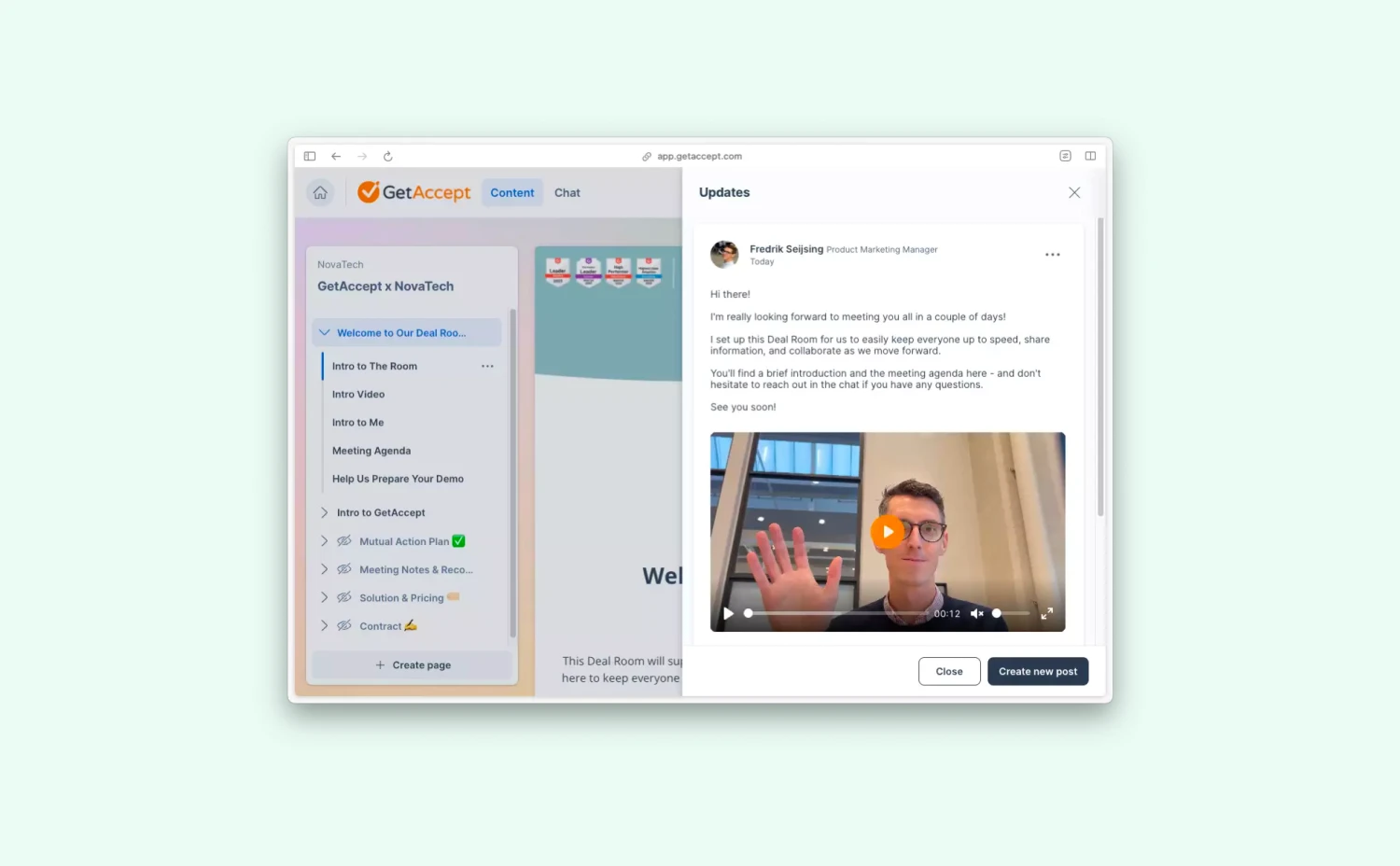
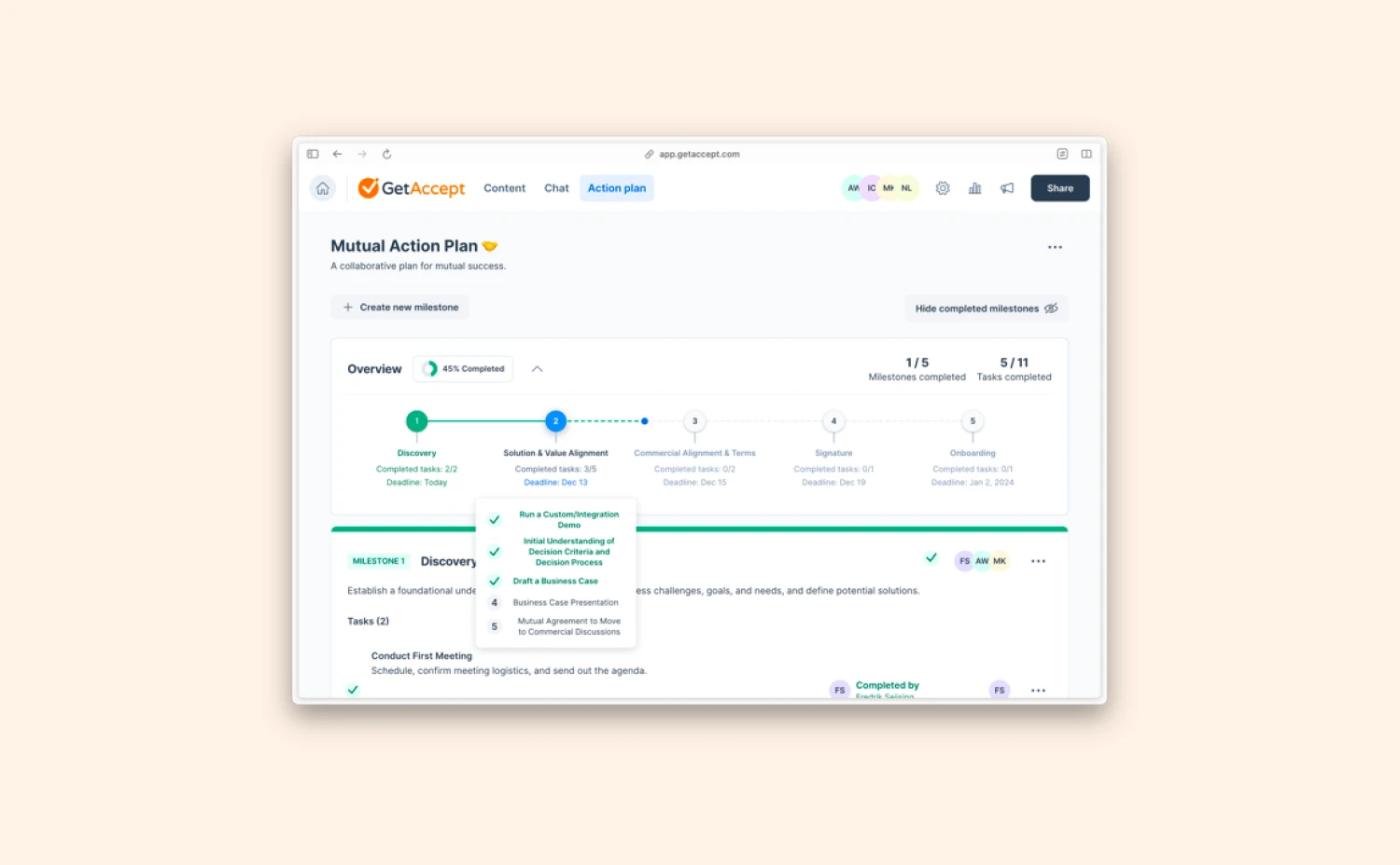
As you’ve hopefully noticed, the look and feel of GetAccept have changed quite a bit throughout the year. Even though it’s always nice to make the aesthetics a little easier on the eye, there’s a lot more to this picture. Let’s take a look!
Overview
The main reason for the design changes in GetAccept this year has not been to update how the product looks, but rather how the product works. By enabling new technology, we’ve been able to make the product faster and more stable, while removing unwanted behaviors (commonly known as “bugs”). It also allows us to work faster, deliver more value, and make a better product for you in the future.
- New global navigation, with a new top menu bar and left side bar.
- Dashboard updates.
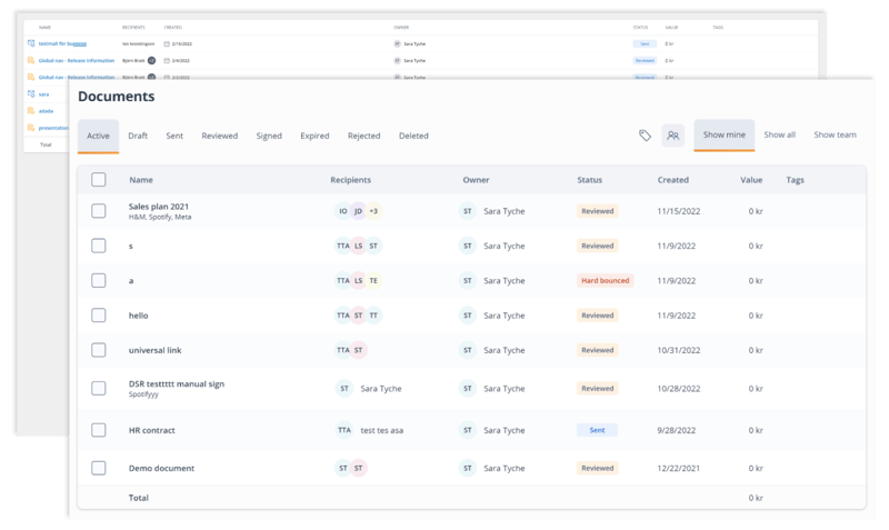
- Updated document view, with new design and layout changes.
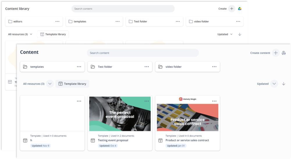
- New components added to the content library.
- New Dealboard.
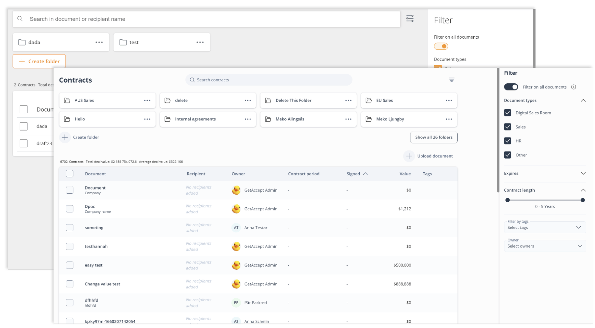
- New Archive.
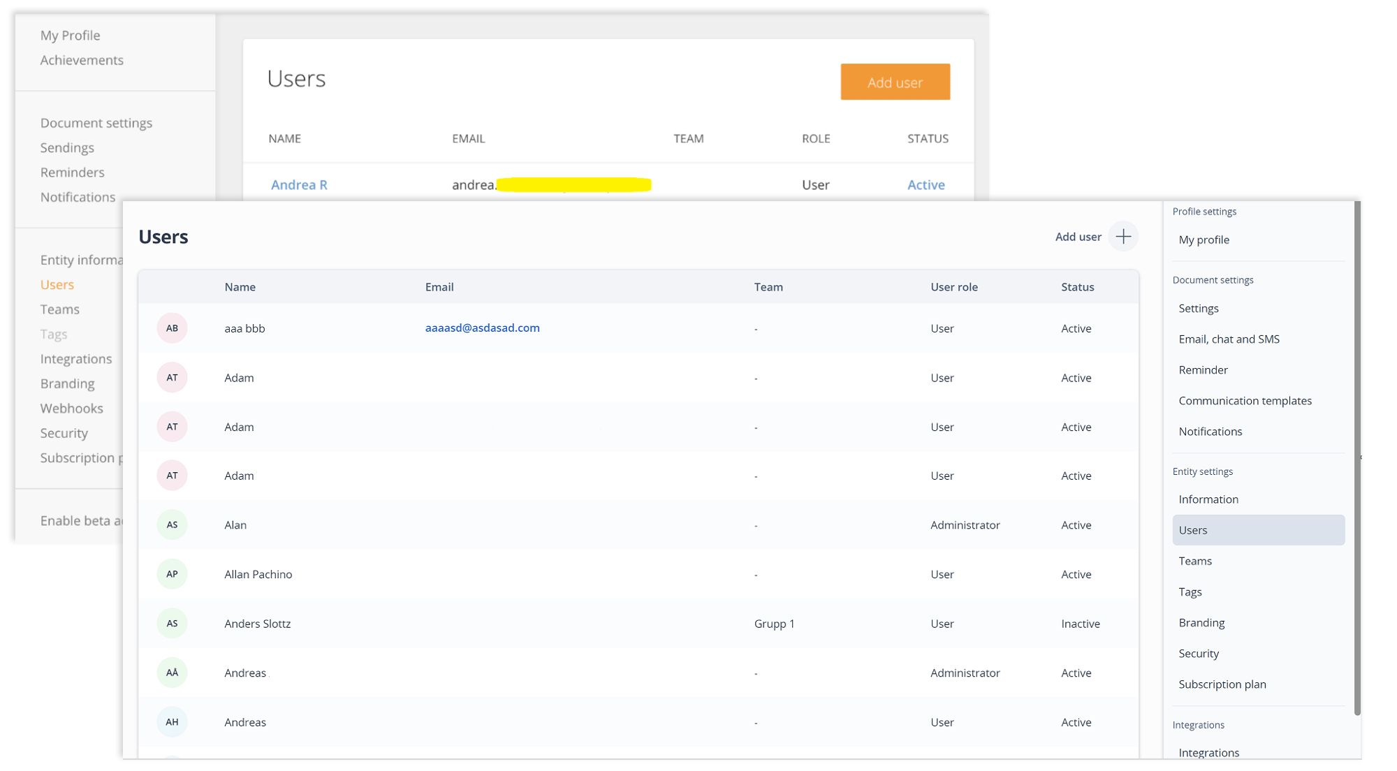
- Updated settings menu & pages.
Q1: Global navigation and Dashboard
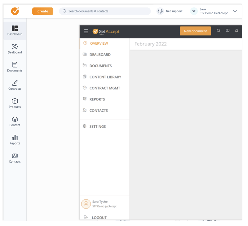
We kicked off the year by making the biggest update to the experience of the product - changing how you navigate. Simplifying the look and feel of the menus, reorganizing menu items into more logical categories, improving the search functionality, and clearly visualizing where you currently are in the product.
Along with this overhaul came the new and improved Dashboard - your go-to place for being on top of everything that’s going on in your GetAccept account.
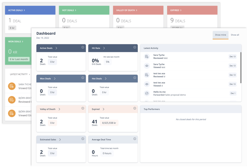
Q2: Document view and Content library
Documents
Content library

Q3: New dealboard
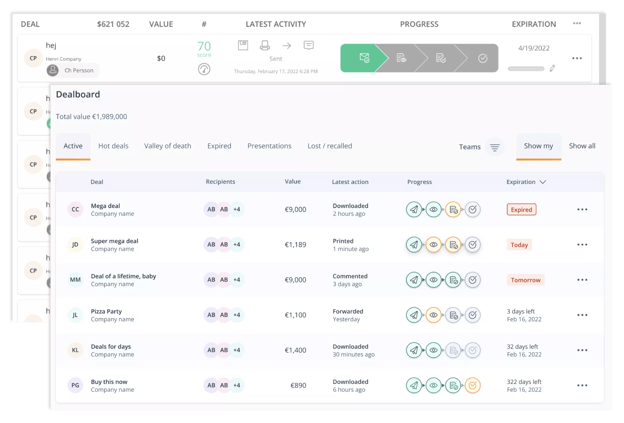
One of the most beloved areas of GetAccept, the Dealboard, finally got its long-awaited overhaul. The layout and interface were cleaned up by improving the progress bar and latest activity made on a deal, allowing you to get the overview you need quickly to decide your next action to take.
Q4: New Archive and Simpler settings overview
Any questions, thoughts or feedback?
We’d love to hear it! Get in touch by sending an email to marketing@getaccept.com.

